Sunday, April 21, 2013

April 21, 2013

I haven't had as much time these last couple weeks to be stamping! :-/ But I snuck in one card this evening. It's such a perky little card - I know I would like to receive it. (I have always been partial to a bright yellow.) This color scheme comes from the Play Date Cafe and the sketch from Freshly Made Sketches.


Supplies:
Stamp Set: Delightful Dozen
Ink: Melon Mambo
Paper: Naturals White, Parker's Patterns DSP, Sahara Sand, Melon Mambo, Daffodil Delight, Whisper White
Tools: Big Shot, Ovals die, 7/8" Scallop Punch
Embellishments: Melon Mambo button (SAB)

Thanks for clicking over to my blog today!

Saturday, April 6, 2013

April 6, 2013 #2

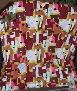
Today as I was doing laundry, I was inspired by one of my scrub tops. 
Here is the card I created:


Here is the top that inspired it:

Supplies
Stamp Set: Vintage Labels
Ink: VersaMark
Paper: Pool Party, Soft Suede textured, Old Olive, Bravo Burgundy, Wisteria Wonder, Primrose Petals, Basic Black
Tools: various hole/circle punches, Black EP, heat tool
Embellishments: Basic Rhinestones

----------

And I also made this one with some Sweet Pea DSP (don't think I'll ever use up all those sheets!), Apothecary Framelits, various markers and a Hostess Set Birthday Bakery.


Thanks for clicking over to my blog today!

April 6, 2013

Today is my parents' 39th anniversary, and I'm celebrating by making cards! ;) 
I'm catching up on some challenges that caught my eye in the last couple weeks. Here a couple from the ColorQ - Challenge #182 (for which I missed the deadline): 

Supplies
Stamp Set: Watercolor Trio
Ink: Perfect Plum, Old Olive (I do not have markers of Wisteria or Limeade), Pool Party, Always Artichoke
Paper: Pool Party, Whisper White
Tools: Big Shot, Vintage Wallpaper EF, Apothecary Framelits
Embellishments: Lucky Limeade ribbon, Basic Pearl

 and Challenge #183 which I coupled with the challenge from Freshly Made Sketches this week.

Supplies
Stamp Set: Delight in Life (that one hadn't seen ink in a long while!), Watercolor Trio
Ink: Calypso Coral, Blushing Bride, Daffodil Delight
Paper: Blushing Bride, Soft Suede, Very Vanilla, Daffodil Delight
Tools: Oval and Scalloped Oval punches
Embellishments: Calypso Coral ribbon

Thanks for clicking over to my blog today!

Thursday, April 4, 2013

Color Refresh 2013

Stampin' Up! has just announced a Color Refresh. I can't decide whether to cry over the discontinuation of Baja Breeze or jump for joy that they're bringing back Blushing Bride and Pear Pizzazz. I, also, could lament the fact that they did NOT bring back Poppy Parade (a color that I failed to appreciate while it was available but have, on multiple occasions since it's disappearance, wished I had). 
I admit I'm a bit baffled by the blues. I must say Bashful Blue could have gone with the last color overhaul! So, that decision I'm good with. I always liked Soft Sky, but I find it weird that they are bringing that color back AND keeping Pool Party... they are so similar. Weird choice. Especially, in light of the removal of my beloved Baja Breeze (with retention of Marina Mist?!). And I've used so much more Not Quite Navy than Night of Navy. I do think I'll like having Bermuda Bay back, though! I am partial to teal colors (and Tempting Turquoise does not count and is another color for which I have no fuzzy feelings!) so I will be glad to have one in the selection again!
Regal Rose was neither here for there to me; same with Pretty in Pink. Blushing Bride was a near immediate favorite when it was an In Color so I'm glad to see it's return. I certainly agree with removing Certainly Celery. Pear Pizzazz is better, one if the best greens they've had, in my opinion. The other leaving-Regals don't bother me, either. And River Rock was one color I could just never quite make work for any project - until they offered the Well Worn DSP.
I am interested to see the Smoky Slate. Assuming it is a light gray, I will like it!
Overall, though, the changes are satisfying. Take a look:

What do you think of the changes?